
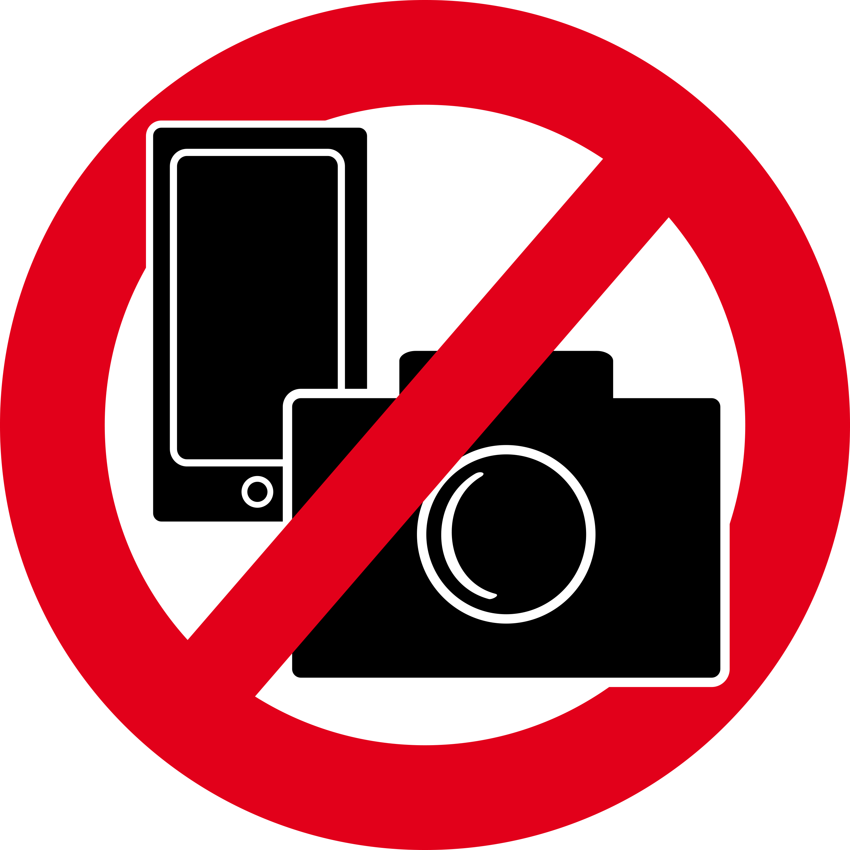
N.B. It happens that people want to make pictures of your poster. We would like to protect your privacy and your research; if you do not want people photographing your poster, please include this image in your poster, and ensure it will be clearly visible at the top of your poster.
Posters will be on display for 1 day only of the conference, either on Monday, Tuesday, or Thursday. Authors are requested to ensure that the poster is on the allocated poster board by 10am on the day and are removed at the end of day. Those not removed by this time will be disposed of by the event coordinators.
Authors are requested to be present at their poster during their allocated poster session.
A freestanding compatible poster board will be provided for your poster. Your poster number will appear on the top right hand side of the board so you can locate your board easily.
You will also be invited to contribute to our e-poster database by uploading your poster. Note that this is in addition to your printed poster. Delegates will be able to view your poster in our e-Hub on screens and tablets.
General instructions for your poster
- Poster size should be A0 portrait oriented (width: 84.1cm / 33.1 inch, Length:118.9cm / 46.8 inch). Do not exceed these dimensions.
- Apply the KISS principle: ‘Keep it Short and Simple’. Avoid putting too much text and figures on the poster.
- Your poster is a visual aid to present your work. The less text the better. Visual elements such as figures, graphs, diagrams should dominate.
- Use a light colour background and dark colour letters for contrast. Use 2-3 colours and avoid overly bright colours.
- Presenting your poster: Prepare a poster pitch of three minutes at the very most, in which you walk your audience through the most important results of your poster. Practice your poster pitch beforehand. Only provide more information to those who ask, remember, most attendees would like to visit as many posters as possible.
- Include a photo of yourself and your contact information, so that people can reach out to you if they look at your poster when you are not there.
Font size & type
- The poster must be easily readable from 2 m distance
- The title should be at least 100 pt, font size the text on the poster at least 36 pt.
- Don’t mix fonts, chose one font for all text blocs in the entire poster. You may wish to use a second font for title + headings and figures and tables.
Text elements
- Use text sparingly. Your poster is not a paper, and there is little time for visitors to read. Let the visuals speak.
- Use columns of max. 70 characters (including spaces) width. Avoid large blocks with text and long sentences (<10 sentences per block; <50 words per block).
- Avoid large blocks of text. Instead, use bulleted statements.
- Avoid abbreviations. When abbreviations or codes are necessary, keep them as simple as possible.
- Choose the line spacing such that the use of sub- and superscripts will not affect the layout of text blocks.
Poster design
- Your title is 90% of your poster. It's the first thing the audience reads. If your title is long and complicated, most will assume the rest of your poster is as well.
- Place your most important information on the top or middle of the poster, not on the bottom where most people cannot easily read it.
- The objectives of the study, the research questions or the hypothesis should be clearly stated in as few words as possible.
- As a rule, methods should be as short and general as possible.
- Results should be presented preferably as figures, graphs, etc.. They should be self-explanatory and include a legend. Providing an interpretation of the results below each image helps the reader understand what the 'take home message' of the image is.
- The conclusions should be succinctly stated on large type font. Many viewers read the conclusions first, and read only your conclusions. Hence the main conclusions should be easy to locate and easy to understand. Indicate in the conclusions:
-
-
- do your findings confirm your hypothesis?
- the novelty your findings
- their relevance beyond your study
-
-
Figures and Graphs
An image says 1000 words. Let your images do the talking, not the text.
- • Graphs or tables should be self-explanatory and include a well-worded, concise legend. Symbols are best explained in an inset within the figure or graph, so the reader doesn't have to jump back and forth between the legend and the image.
- Put legends above a table and below a figure.
- Keep legends short (10-25 words).
Figures
- Properly label the x- and y-axis of graphs, include units.
- Keep graphs as simple as possible.
- Include the results of statistical analyses (significance levels) in the graphs by using discriminating letter codes (a, ab, b) or asterisks (*, **, ***).
Tables
- Do not use tables that contain more than 20 items. Complex data should not be included in your poster but may be provided in a separate information sheet.
- Do not give more decimals than necessary to show meaningful variation.
References and further reading
- http://betterposters.blogspot.com/
- http://colinpurrington.com/tips/poster-design
- https://www.nature.com/nature/journal/v536/n7614/full/nj7614-115a.html
- https://www.the-scientist.com/?articles.view/articleNo/31071/title/Poster-Perfect/
- https://guides.nyu.edu/posters
- https://www.makesigns.com/tutorials/scientific-poster-parts.aspx
- https://www.youtube.com/watch?v=EL5YwkiqBho&feature=youtu.be
- Gosling PJ 1999 Scientist’s Guide to Poster Presentations. Kluwer Academic / Plenum Publishers, New York, USA.
- Malmfors B, Garnsworthy P and Grossman M 2000 Writing and Presenting Scientific Papers. Nottingham University Press, Nottingham, UK.
Printing your poster
In case of necessity or emergency, it is possible to have your poster printed at the EPFL in Lausanne.
In order to provide you the best service, capacity is limited. So if you already know that you cannot bring your poster, we recommend you to already contact the Print Centre before the conference.
Repro Print Service
Contact Person: Steeve Chevalley
steeve.chevalley@epfl.ch
(please CC: thomas.reynaud@epfl.ch)
It is possible to print your poster onsite (payment with credit cards), please note the summer opening hours:
Monday - Friday 08:30 – 11.00
Repro is located on the EPFL Campus, only a couple minutes walk from the SwissTech Convention Center and the Metro Stop. Take the underpass and go right upon exit, to go to the BP building.
For more information: https://www.epfl.ch/campus/services/repro/contact/#ancre3